- till now, whenever we called plot on pandas series, it was actually calling matplotlib bts
- however, it can have limitations, which is when we might want to interact with matplotlib
- most common way of importing matplotlib -
import matplotlib.pyplot as plt
- when we do the following, it defaults values on the x axes to be 0, 1, 2, …
plt.plot([2, 6, 2, 4, 8])
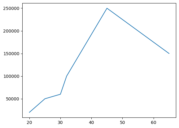
- we can specify values for both x and y as follows -
salaries = [20000, 50000, 60000, 100000, 250000, 150000]
ages = [20, 25, 30, 32, 45, 65]
plt.plot(ages, salaries)
- note - when we call plot in jupyter notebook, before the actual graph, we see a line like this -
[<matplotlib.lines.Line2D at 0x7cd66c249180>]. this is actually the output of plot, but jupyter is smart enough to show us the output at the back of it as well. we will have to call plt.show() if we are not working on a jupyter notebook - matplotlib terminology - the top level container is a figure
- a figure can have multiple axes
- each axes is a combination of labels, data, etc
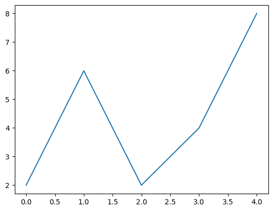
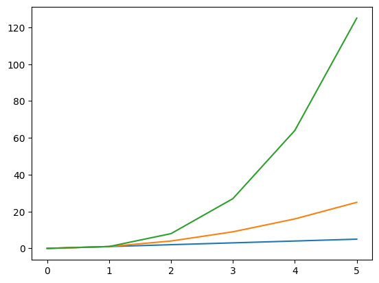
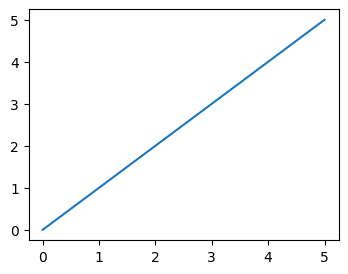
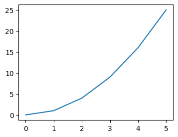
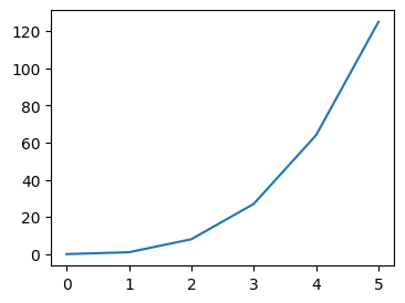
- assume we have the following sample data -
nums = range(6)
nums_squared = [num**2 for num in nums]
nums_cubed = [num**3 for num in nums]
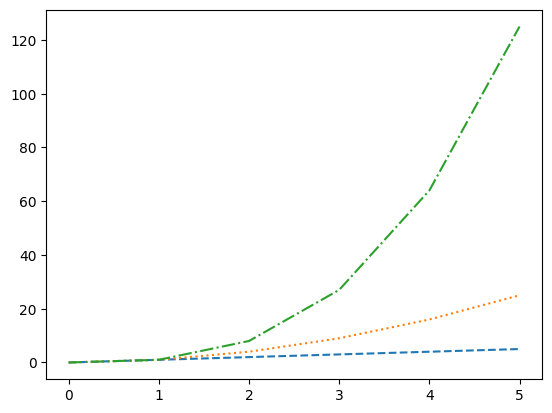
- when we have the following code, all of them are plotted on the same figure and the same axes
plt.plot(nums)
plt.plot(nums_squared)
plt.plot(nums_cubed)
- we call figure to create a new figure and make it the current figure. so when we call plot, it basically plots on the current active figure. so, with the code below, all of them are plotted on different figures
plt.figure(figsize=(4,3))
plt.plot(nums)

plt.figure(figsize=(4,3))
plt.plot(nums_squared)

plt.figure(figsize=(4,3))
plt.plot(nums_cubed)
- note how we control the size of a figure in matplotlib - we can pass figsize and dpi or dots per inch to figure. i usually just touch figsize, which defaults to 6.4, 4.8
- we can specify the linestyle when plotting as follows. notice the shorthand at the third call as well
plt.plot(nums, nums, linestyle='dashed')
plt.plot(nums, nums_squared, linestyle='dotted')
plt.plot(nums, nums_cubed, linestyle='-.')
- when calling plot, we can specify parameters like color, linewidth, etc as well if needed
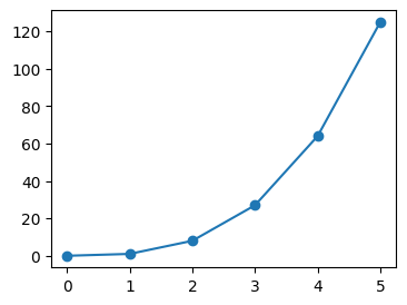
- we can also specify markers and their styling
plt.plot(nums, nums_cubed, marker='o')
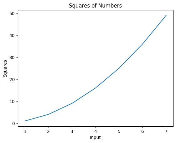
- we can use title to set a title for the axes, and labels to set labels for the x and y axis individually
plt.plot(nums, nums_squared)
plt.title("Squares of Numbers")
plt.xlabel("Input")
plt.ylabel("Squares")
- remember - all these methods we see - plot, title, xlabel and ylabel, and others that we see later - also accept a ton of options to control the size, spacing, color, positioning, etc. refer documentation as and when needed
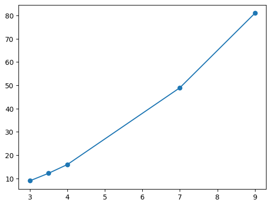
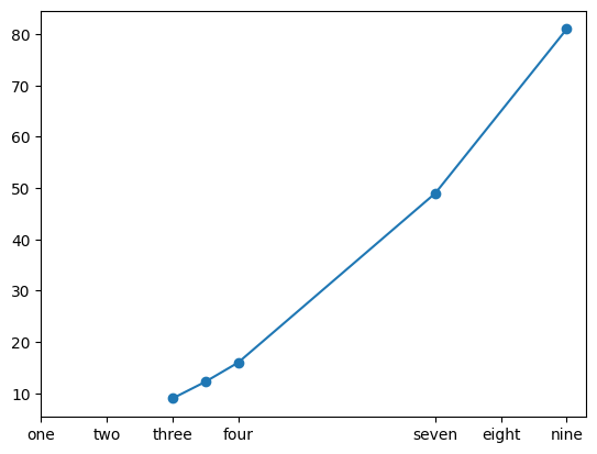
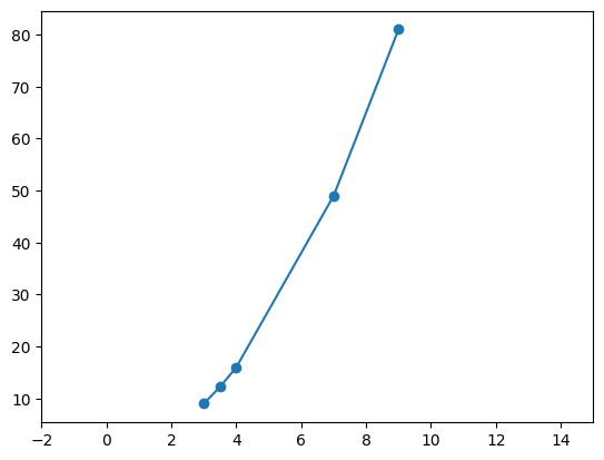
- when we try to plot the below, look at the default graph. notice how on x axis for e.g., matplotlib itself decided that it should start the ticks from 3 etc
nums = [3, 3.5, 4, 7, 9]
nums_squared = [num**2 for num in nums]
plt.plot(nums, nums_squared, marker='o')
- option 1 - we can add custom ticks using xticks and yticks. it serves two purposes -
- we can only provide the first argument. this controls what ticks should show up
- we can provide the second argument as well. this controls what the actual tick should be named inside the graph
plt.plot(nums, nums_squared, marker='o')
plt.xticks([1, 2, 3, 4, 7, 8, 9], ['one', 'two', 'three', 'four', 'seven', 'eight', 'nine'])
- option 2 - we can only modify the limits. e.g. we would like the x axis start from -2 and end at 20 for some reason
plt.plot(nums, nums_squared, marker='o')
plt.xlim(-2, 15)
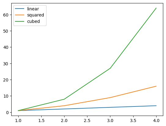
- legend - helps distinguish between the different graphs using labels when they are on the same axes in the same figure
nums = [1, 2, 3, 4]
nums_squared = [num ** 2 for num in nums]
nums_cubed = [num ** 3 for num in nums]

plt.plot(nums, nums, label='linear')
plt.plot(nums, nums_squared, label='squared')
plt.plot(nums, nums_cubed, label='cubed')

plt.legend()
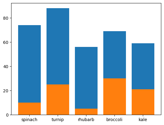
- plotting bar charts. assume we have the following data -
plants = ['spinach', 'turnip', 'rhubarb', 'broccoli', 'kale']
died = [10, 25, 5, 30, 21]
germinated = [74, 88, 56, 69, 59]
- by default, the different charts would be one on top of another -
plt.bar(plants, germinated)
plt.bar(plants, died)
- this is how i got them to show one beside another -
- i ensured width of the first graph is positive while the second one is negative, so that they appear on either sides of the x tick
- i also ensured they are 0.25% of their actual width, as this ensures the right spacing. if for e.g. i did 0.5, the second bar of a tick will touch the first bar of the next tick
- i set align to edge. this alsigns them to the edge of the tick. the default is center (refer the graph created by default above)
plt.bar(plants, germinated, width=0.25, align='edge')
plt.bar(plants, died, width=-0.25, align='edge')
- bar also receives another keyword argument - bottom
plt.bar(plants, germinated, bottom=[20, 20, 20, 20, 20])
plt.ylim(0, 120)
- use case of the stupidity above 🤣 - we can get the different bars to stack one on top of another. the y coordinates of one graph becomes the bottom of another
plt.bar(plants, died, bottom=germinated, label='died')
plt.bar(plants, germinated, label='germinated')
plt.legend()
- we can use barh instead of bar for horizontal bar graphs. notice how for stacking, the bottom changes to left
plt.barh(plants, died, left=germinated, label='died')
plt.barh(plants, germinated, label='germinated')
plt.legend()
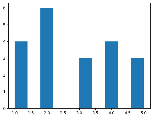
- histogram - assume we have the following data. note - i did a value count to explain the distribution of data -
nums = [1,2,2,3,5,4,2,2,1,1,3,4,4,2,1,5,2,3,4,5]

{ num: nums.count(num) for num in nums }
# {1: 4, 2: 6, 3: 3, 4: 4, 5: 3}
- when i try to create a histogram on this data, it looks as follows by default -
plt.hist(nums)
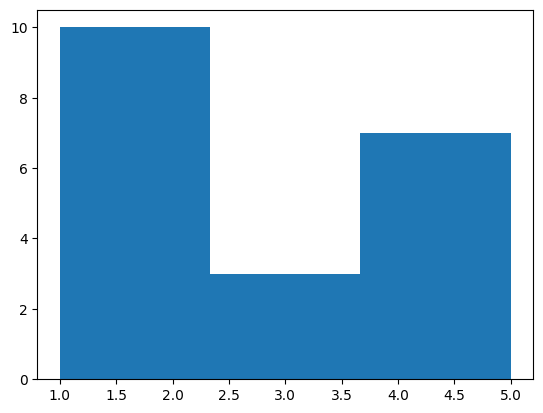
- we can configure the bins as follows. my understanding - 1 and 2 together have frequency of 10, 3 has frequency of 3 while 4 and 5 together have frequency of 7. now, the range has been divided into three parts 1-2.33, 2.33-3.66, 3.66-4.99, and the histogram has been plotted accordingly
plt.hist(nums, bins=3)
- histograms are a little different i feel because unlike pie chart, bar graph, etc where we give the actual values to be plotted, here, we only give a series of values and it autmatically calculates the frequency and bins them accordingly
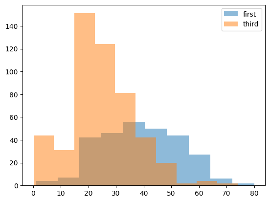
- a realisitic example - comparing the distribution of ages of people travelling in first class vs third class in the titanic. observation - more younger people were travelling in third class, wheras more older people were travelling in first class. also, note how we change the alpha to visualize them simultaneously
titanic = pd.read_csv('/content/drive/MyDrive/Python - Basic Data Analysis/titanic.csv')

# clean the age column
titanic.replace({ 'age': { '?': None } }, inplace=True)
titanic['age'] = titanic['age'].astype('float')

# extract the ages of first and third class
first_class_ages = titanic[titanic['pclass'] == 1]['age']
third_class_ages = titanic[titanic['pclass'] == 3]['age']

# plot the ages
plt.hist(first_class_ages, alpha=0.5, label='first')
plt.hist(third_class_ages, alpha=0.5, label='third')

plt.legend()
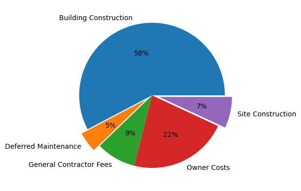
- pie charts
- we use the explode parameter to disconnect the sectors from the pie chart. the fraction determines how far out the sectors would be from the pie. the order is the same as the order of the labels
- we use the autopct parameter to add percentages inside the sectors. we are using
autopct='%.0f%%' here, if we would have used for e.g. autopct='%.2f', it would have shown in this form - 57.73 (with 2 decimal places and without the %)
plt.pie(costs, labels=labels, autopct='%0.0f%%', explode=(0, 0.1, 0, 0, 0.1))
plt.show()
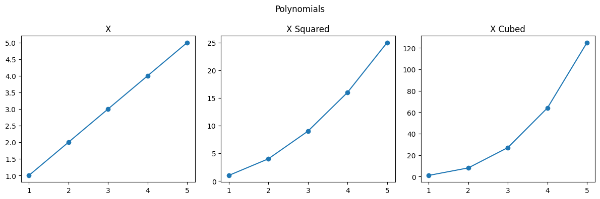
- subplots - multiple axes in the same figure
- we use subplot to tell the dimensions and the correct subplot index. in the example below, we say 1 row, 3 columns, and go 1, 2 and 3 respectively for the index
- title is used for individual axes headings while suptitle is used for the figure heading
- we call tight layout, as it helps python adjust the padding around subplots
nums = [1, 2, 3, 4, 5]
nums_squared = [num ** 2 for num in nums]
nums_cubed = [num ** 3 for num in nums]

plt.figure(figsize=(12, 4))
plt.suptitle("Polynomials")

plt.subplot(1, 3, 1)
plt.title("X")
plt.plot(nums, nums)

plt.subplot(1, 3, 2)
plt.title("X Squared")
plt.plot(nums, nums_squared)

plt.subplot(1, 3, 3)
plt.title("X Cubed")
plt.plot(nums, nums_cubed)

plt.tight_layout()
plt.show()
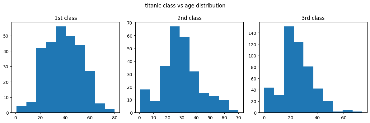
- now, imagine if we go back to our titanic example, and we want to plot all three classes - first second and third in different subplots -
titanic = pd.read_csv('/content/drive/MyDrive/Python - Basic Data Analysis/titanic.csv')
titanic['age'] = pd.to_numeric(titanic['age'], errors='coerce')

first_class_ages = titanic[titanic['pclass'] == 1]['age']
second_class_ages = titanic[titanic['pclass'] == 2]['age']
third_class_ages = titanic[titanic['pclass'] == 3]['age']

plt.figure(figsize=(12, 4))
plt.suptitle('titanic class vs age distribution')

plt.subplot(1, 3, 1)
plt.title('1st class')
plt.hist(first_class_ages)

plt.subplot(1, 3, 2)
plt.title('2nd class')
plt.hist(second_class_ages)

plt.subplot(1, 3, 3)
plt.title('3rd class')
plt.hist(third_class_ages)

plt.tight_layout()
plt.show()
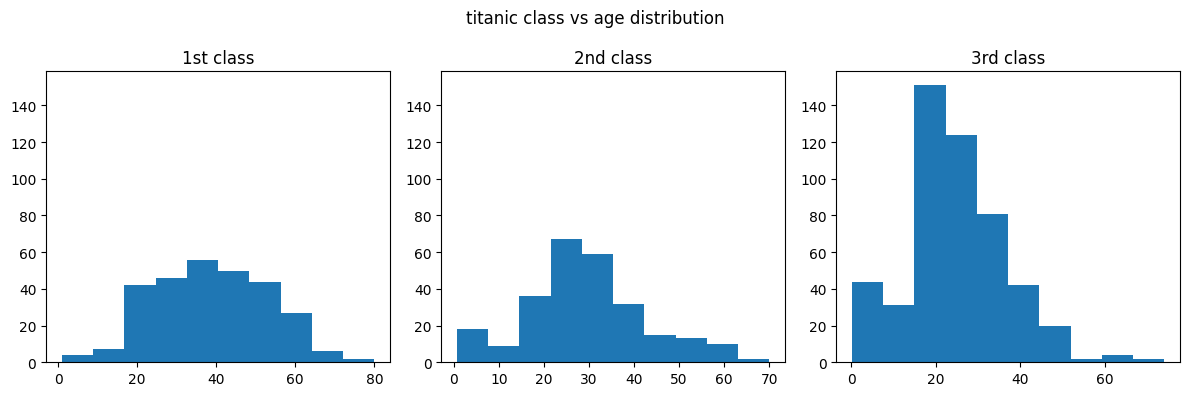
- issue - we know that the scale in the third vs other plots are different i.e. a lot more people are travelling in the third class than in the 2nd and 1st class. this is not evident right off the bat by looking at the graph. hence, we can specify the sharey parameter
# ...
axes = plt.subplot(1, 3, 1)
# ...
plt.subplot(1, 3, 2, sharey=axes)
# ...
plt.subplot(1, 3, 3, sharey=axes)
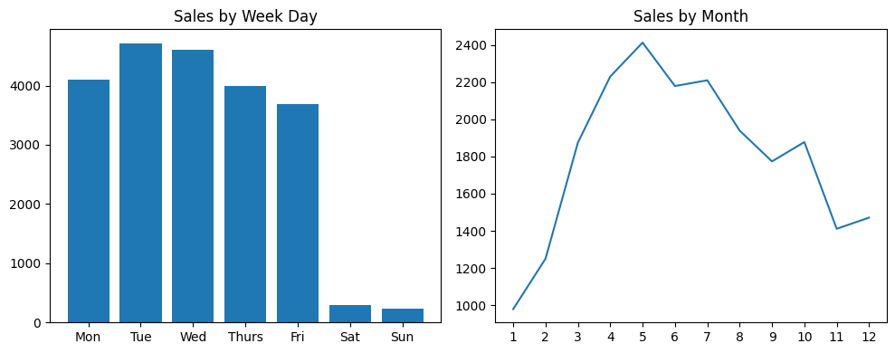
- question - write the code for achieving the below. note - do not use the plot method of pandas series and dataframes
houses = pd.read_csv('/content/drive/MyDrive/Python - Basic Data Analysis/kc_house_data.csv', parse_dates=['date'])

sales_by_month = houses['date'].dt.month.value_counts().sort_index()
# date
# 1      978
# 2     1250
# 3     1875
# 4     2231
# 5     2414
# 6     2180
# 7     2211
# 8     1940
# 9     1774
# 10    1878
# 11    1411
# 12    1471

sales_by_week_day = houses['date'].dt.day_of_week.value_counts().sort_index()
# date
# 0    4099
# 1    4715
# 2    4603
# 3    3994
# 4    3685
# 5     287
# 6     230

plt.figure(figsize=(10, 4))

plt.subplot(1, 2, 1)
week_days = ['Mon', 'Tue', 'Wed', 'Thurs', 'Fri', 'Sat', 'Sun']
plt.title('Sales by Week Day')
plt.xticks(sales_by_week_day.index, week_days)
plt.bar(sales_by_week_day.index, sales_by_week_day.values)

plt.subplot(1, 2, 2)
plt.xticks(range(1, 13))
plt.title('Sales by Month')
plt.plot(sales_by_month.index, sales_by_month.values)

plt.tight_layout()
plt.show()
- note how we use index and values that we disccussed here
- we also had to sort by index first before beginning to plot, because value counts sorts by values by default
- notice the use of xticks for renaming the labels for weekdays. i had to do the same thing for months as well, otherwise the default was 2, 4, 6, 8…
- plotting a pandas series
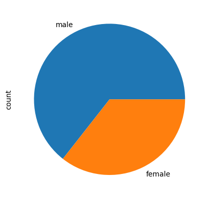
titanic['sex'].value_counts().plot(kind='pie')
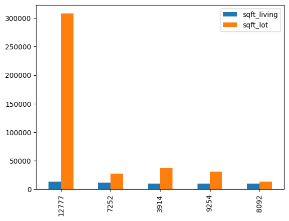
- plotting a pandas dataframe - note how it is making a bar for all columns automatically
house_area
#        sqft_living  sqft_lot
# 12777  13540        307752
# 7252   12050        27600
# 3914   10040        37325
# 9254   9890         31374
# 8092   9640         13068

house_area.plot(kind='bar')
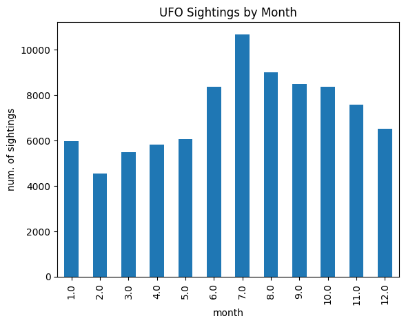
- ufo sightings by month - we use this series in the next few points, and this is what our data looks like -
ufo_sightings_by_month
# 1.0      5979
# 2.0      4559
# 3.0      5494
# 4.0      5817
# 5.0      6063
# 6.0      8357
# 7.0     10682
# 8.0      8997
# 9.0      8498
# 10.0     8371
# 11.0     7596
# 12.0     6525
- for providing parameters like title, we have two options -
- option 1 - in the same line. disadvantage - lesser options to configure styling etc
ufo_sightings_by_month.plot(kind='bar', title='UFO Sightings by Month', xlabel='month', ylabel='num. of sightings')
- option 2 - i think the central idea is instead of interacting only with pandas plot api, we mix with calls to matplotlib apis directly like we saw in matplotlib. advantage - now, we can configure styling etc
ufo_sightings_by_month.plot(kind='bar')

plt.title('UFO Sightings by Month')
plt.xlabel('month')
plt.ylabel('num. of sightings')
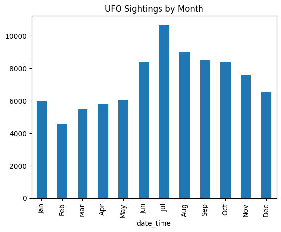
- now, we would like to use months abbreviations instead. we have multiple options -
- option 1 - use rename to rename indices
months_lookup = { idx + 1: months[idx] for idx in range(12) }
# {1: 'Jan', 2: 'Feb', 3: 'Mar', 4: 'Apr', 5: 'May', 6: 'Jun', 7: 'Jul', 8: 'Aug', 9: 'Sep', 10: 'Oct', 11: 'Nov', 12: 'Dec'}

ufo_sightings_by_month_abbrev = ufo_sightings_by_month.rename(index=months_lookup)
ufo_sightings_by_month_abbrev.plot(kind='bar', title='UFO Sightings by Month')
- option 2 - use xticks. this is useful if we just want to modify plots but it might make testing etc difficult
ufo_sightings_by_month.plot(kind='bar', title='UFO Sightings by Month')
plt.xticks(range(12), labels=months)
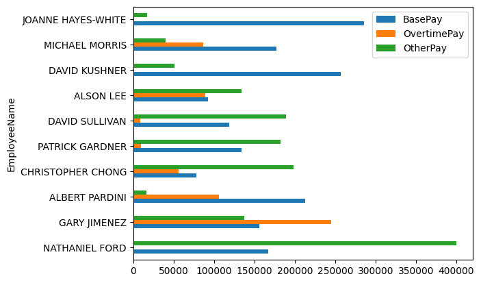
- by default, bar charts for dataframes looks as follows. understand that pandas is coming with reasonable defaults and helpers. there was so much effort was required from our end when doing this manually using matplotlib - specifying labels and legends, specifying the align property with a negative width, etc
salaries
#                    BasePay    OvertimePay  OtherPay
# EmployeeName
# NATHANIEL FORD     167411.18  0.00         400184.25
# GARY JIMENEZ       155966.02  245131.88    137811.38
# ALBERT PARDINI     212739.13  106088.18    16452.60
# CHRISTOPHER CHONG  77916.00   56120.71     198306.90

salaries.plot(kind='barh')
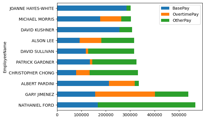
- making a stacked version too is so much easier compared to doing it via matplotlib manually by specifying bottom / left etc
salaries.plot(kind='barh', stacked=True)
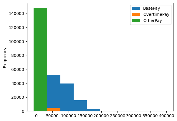
- the usual way -
.plot(kind='hist'). it creates all graphs in the same axessalaries.plot(kind='hist')
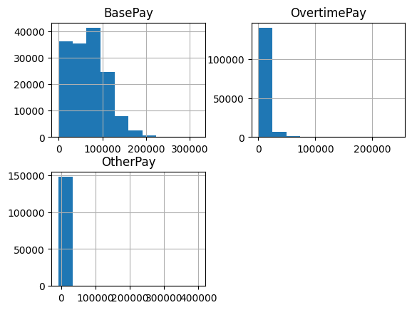
- calling
.hist() directly. it creates different axes for the different columns - feels like subplotssalaries.hist()
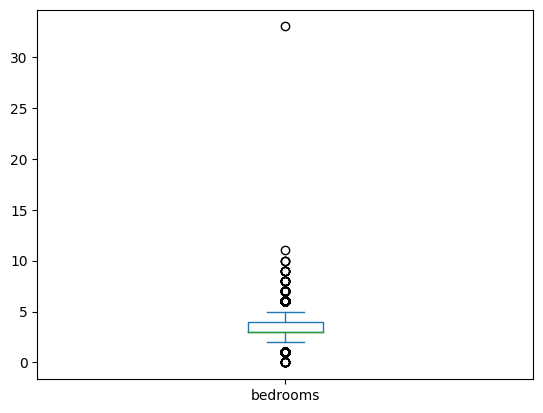
- box plot - this too helps visualize distribution of values like histogram. summary according to me, might be wrong -
- we have a line at the median (the green line)
- the general distribution of data lies between the two whiskers (the two standalone blue lines)
- the fliers depict the outliers (the circles). e.g. one house had 33 or so bedrooms, so look at the boxplot
houses['bedrooms'].plot(kind='box')
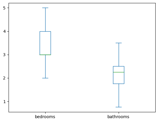
- we can view the list of configuration parameters here. e.g. we can disable the fliers
houses[['bedrooms', 'bathrooms']].plot(kind='box', showfliers=False)
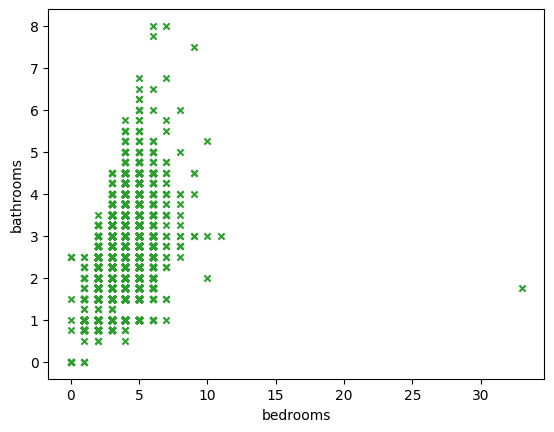
- scatter plot - how different variables, e.g. bedrooms and bathrooms correlate to eachother. refer this for different configuration options
houses.plot(kind='scatter', x='bedrooms', y='bathrooms', marker='x', c='#2ca02c')
- adding multiple graphs to the same axes on the same figure - same as we saw in matplotlib i.e. we need to call figure on plt for creating a new figure, else the current active figure is used
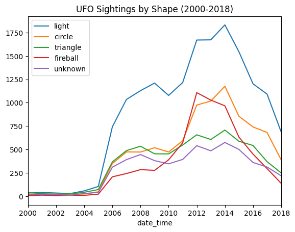
- e.g. - ufo sightings have a shape attribute. find the 5 most common shapes, and plot them on the same axes. use a legend to differentiate between them. plot them for the range 2000-2018
common_shapes = ufos['shape'].value_counts().nlargest(5)

for common_shape in common_shapes.index:
    years = ufos[ufos['shape'] == common_shape]['date_time'].dt.year
    years.value_counts().sort_index().plot(kind='line', label=common_shape)

plt.legend()
plt.xlim(2000, 2018)
plt.title('UFO Sightings by Shape (2000-2018)')
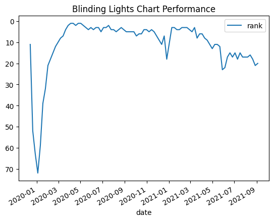
- e.g. plot how blinding lights performed on the charts. note how we can specify the x and y attributes when plotting dataframes. also, note how we can invert the y axis - a rank is better when lower, and we want to show a higher rank using a peak / lower rank using a trench
billboard_charts = pd.read_csv('/content/drive/MyDrive/Python - Basic Data Analysis/billboard_charts.csv', parse_dates=['date'])
blinding_lights = billboard_charts[billboard_charts['song'] == 'Blinding Lights']

blinding_lights.plot(y='rank', x='date')
plt.gca().invert_yaxis()
plt.title('Blinding Lights Chart Performance')
- when we try plotting a dataframe, the different columns would be plotted on the same axes by default
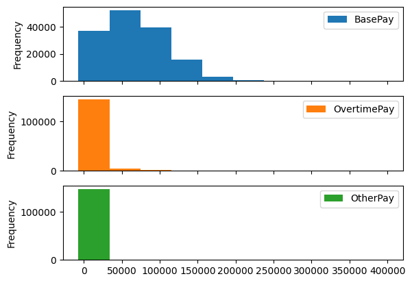
salaries.plot(kind='hist')
- we can create subplots instead just by passing in keyword arguments
salaries.plot(kind='hist', subplots=True)
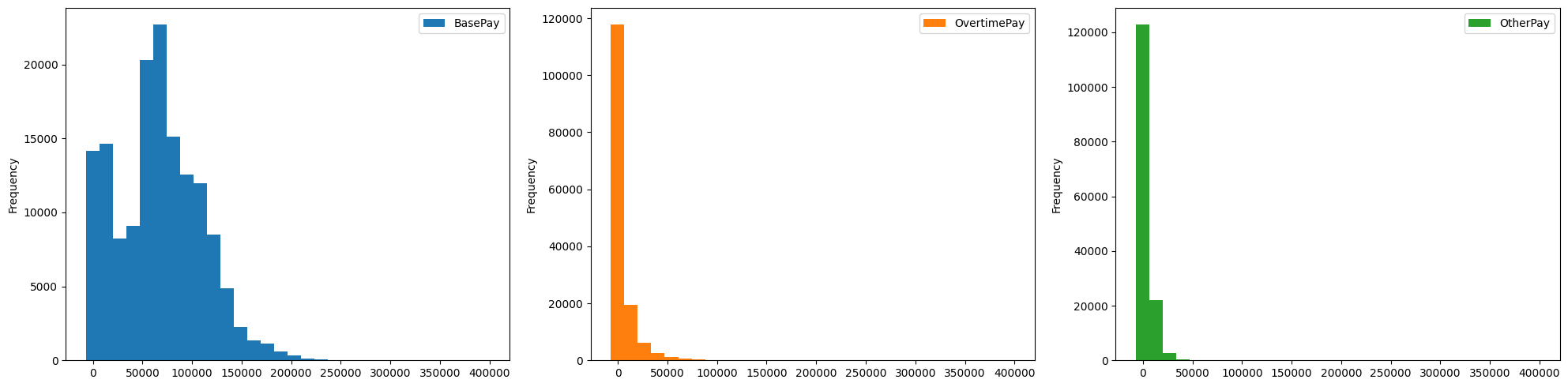
- we can configure other parameters like layout (the dimensions), sharex / sharey, etc as well, already discussed in matplotlib
salaries.plot(kind='hist', subplots=True, layout=(1, 3), figsize=(20, 5), sharex=True, bins=30)
plt.tight_layout()
- note, my understanding - the above method of passing in true for the subplots keyword argument works because we wanted to plot the different columns of the same dataframe. what if we wanted to plot entirely different series etc on the same figure on different axes. we use a combination of interacting with matplotlib apis directly and through pandas apis. apis used -
- subplots can be called for setting the dimensions of the subplot, setting figure size, etc. it returns both the figure and the axes created in the process. the axes we receive has the same rows / columns as the dimensions we specify. note that parameters like
sharex / sharey can be passed into this subplots call as well - note how we pass in axes argument to plot of pandas series / dataframe
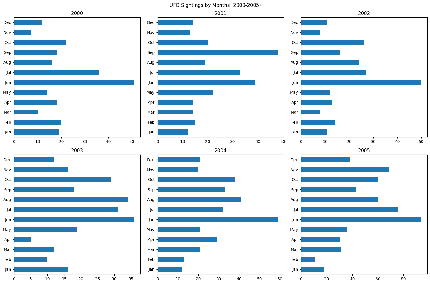
months = ['Jan', 'Feb', 'Mar', 'Apr', 'May', 'Jun', 'Jul', 'Aug', 'Sep', 'Oct', 'Nov', 'Dec']

fig, axes = plt.subplots(2, 3, figsize=(15, 10))

data_2000 = ufos[ufos['date_time'].dt.year == 2000]['date_time'].dt.month.value_counts().sort_index()
data_2000.plot(kind='barh', ax=axes[0][0], ylabel='', title=2000)
axes[0][0].set_yticks(range(12), labels=months)

data_2001 = ufos[ufos['date_time'].dt.year == 2001]['date_time'].dt.month.value_counts().sort_index()
data_2001.plot(kind='barh', ax=axes[0][1], ylabel='', title=2001)
axes[0][1].set_yticks(range(12), labels=months)

data_2002 = ufos[ufos['date_time'].dt.year == 2002]['date_time'].dt.month.value_counts().sort_index()
data_2002.plot(kind='barh', ax=axes[0][2], ylabel='', title=2002)
axes[0][2].set_yticks(range(12), labels=months)

data_2003 = ufos[ufos['date_time'].dt.year == 2003]['date_time'].dt.month.value_counts().sort_index()
data_2003.plot(kind='barh', ax=axes[1][0], ylabel='', title=2003)
axes[1][0].set_yticks(range(12), labels=months)

data_2004 = ufos[ufos['date_time'].dt.year == 2004]['date_time'].dt.month.value_counts().sort_index()
data_2004.plot(kind='barh', ax=axes[1][1], ylabel='', title=2004)
axes[1][1].set_yticks(range(12), labels=months)

data_2005 = ufos[ufos['date_time'].dt.year == 2005]['date_time'].dt.month.value_counts().sort_index()
data_2005.plot(kind='barh', ax=axes[1][2], ylabel='', title=2005)
axes[1][2].set_yticks(range(12), labels=months)

plt.suptitle(f'UFO Sightings by Months (2000-2005)')

plt.tight_layout()
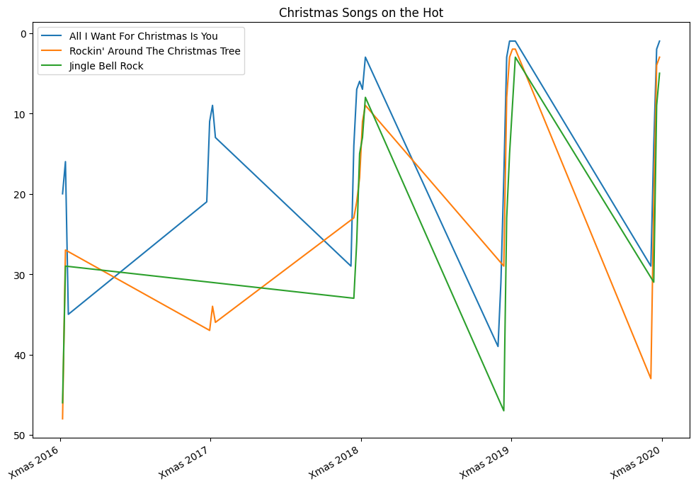
- for e.g. reproduce the graph below -
- this time around, there is just one axes. so, we can call set xticks, set title, etc on this one axes itelf
- again, since this is ranks of songs, we invert the y axis
- the labels on x axes was another challenge here, but easy when using xticks
- pandas, matplotlib, etc are smart enough to understand dates even if we specify them like strings - note how we specify strings for dates when using in between and setting xticks
years = [2016, 2017, 2018, 2019, 2020]
christmases = [f'{year}-12-25' for year in years]
# ['2016-12-25', '2017-12-25', '2018-12-25', '2019-12-25', '2020-12-25']

songs = [
    { 'song': 'All I Want For Christmas Is You', 'artist': 'Mariah Carey' },
    { 'song': 'Rockin\' Around The Christmas Tree', 'artist': 'Brenda Lee' },
    { 'song': 'Jingle Bell Rock', 'artist': 'Bobby Helms' }
]

period = billboard_charts['date'].between(christmases[0], christmases[-1])

_, axes = plt.subplots(1, 1, figsize=(10, 7))

plt.gca().invert_yaxis()

years = [2016, 2017, 2018, 2019, 2020]
christmas_values = [pd.to_datetime(f'12-25-{year}') for year in years]
christmas_labels = [f'Xmas {year}' for year in years]

axes.set_xticks(christmas_values, christmas_labels)
axes.set_title('Christmas Songs on the Hot')

for song in songs:
    condition = (billboard_charts['song'] == song['song']) & (billboard_charts['artist'] == song['artist'])
    billboard_charts[condition & period].plot(kind='line', x='date', y='rank', ax=axes, label=song['song'], xlabel='')

plt.legend(loc='upper left')
plt.tight_layout()
plt.show()
- for saving a figure to a local file, use
savefig(path.png)
- assume i have data for stocks of different cars like below -
car_stocks

#    Symbol  Date        Open        High        Low         Close       Adj Close   Volume
# 0  RIVN    2021-11-10  106.750000  119.459999  95.199997   100.730003  100.730003  103679500
# 1  RIVN    2021-11-11  114.625000  125.000000  108.010002  122.989998  122.989998  83668200
# 2  RIVN    2021-11-12  128.645004  135.199997  125.250000  129.949997  129.949997  50437500
- to get the mean of a particular stock, i can do the following -
car_stocks[car_stocks['Symbol'] == 'RIVN']['Close'].mean() # 127.523
- but what if i wanted the mean of all of the stocks individually in a dataframe? i can do it as follows
car_stocks.groupby('Symbol')['Close'].mean()

# Symbol
# GM       62.164615
# LCID     49.829231
# RIVN    127.523077
# Name: Close, dtype: float64
- notice how groupby gives us a pandas data frame group by object
car_stocks.groupby('Symbol')

# <pandas.core.groupby.generic.DataFrameGroupBy object at 0x77f885d61a90>
- we can call ngroups to see the number of groups -
car_stocks.groupby('Symbol').ngroups # 3
- we can call groups to see the actual groups. it is a dictionary, where the keys are the actual keys we used to group, while the values are the indices of the rows
car_stocks.groupby('Symbol').groups

# {'GM': [26, 27, 28, 29, 30, 31, 32, 33, 34, 35, 36, 37, 38],
# 'LCID': [13, 14, 15, 16, 17, 18, 19, 20, 21, 22, 23, 24, 25],
# 'RIVN': [0, 1, 2, 3, 4, 5, 6, 7, 8, 9, 10, 11, 12]}
- iterating over the dataframe group by object using a for each group - we get back a tuple of the form group name, dataframe. ofcourse, the dataframe only contains rows belonging to the group. the columns used in the group by clause would not be present in the dataframe. use case - useful when the aggregation functions available to us by default are not enough, and we want to run some custom functionality
for name, group in car_stocks.groupby('Symbol'):
    print(name)
    print('--------------------')
    print(group[['Low', 'High']].describe())
    print('\n')

# GM
# --------------------
#              Low       High
# mean   61.051539  63.129231
# min    57.730000  60.560001
# max    62.630001  65.180000
#
#
# LCID
# --------------------
#              Low       High
# mean   46.442539  51.811538
# min    39.341000  45.000000
# max    50.709999  57.750000
#
#
# RIVN
# --------------------
#               Low        High
# mean   119.150000  135.309230
# min     95.199997  114.500000
# max    153.779999  179.470001
- when we tried calculating the mean of the closing price earlier -
- when we did
car_stocks.groupby('Symbol'), we got back a dataframe group by object - when we added a
car_stocks.groupby('Symbol')['Close'], we got back a series group by object - we finally called
car_stocks.groupby('Symbol')['Close'].mean() to get back the mean of closing price for each symbol (i.e. stock)
- if we would have called mean on the dataframe group by object directly, we would have gotten back a dataframe -
car_stocks.groupby('Symbol').mean()

#         Open        High        Low
# Symbol
# GM      61.937693   63.129231   61.051539
# LCID    48.761538   51.811538   46.442539
# RIVN    127.710000  135.309230  119.150000
- split, apply, combine - this is a workflow. going back to the closing price mean by stock example -
- we split into different parts - e.g. forming groups using groupby
- we then apply a function on each of the parts - e.g. performing a mean on each of these groups individually
- we finally combine the results from each of these parts - we get back a series containing means for each of the group
- we can also run multiple aggregation functions at once - below, we run it on both dataframe group by object and series group by object. running it on the dataframe group by object results in hierarchical columns -
car_stocks.groupby('Symbol')['Close'].agg(['mean', 'min', 'max'])

#         mean        min         max
# Symbol
# GM      62.164615   59.270000   64.610001
# LCID    49.829231   40.750000   55.520000
# RIVN    127.523077  100.730003  172.009995

car_stocks.groupby('Symbol').agg(['mean', 'min', 'max'])
#         Open                                High                                Low
#         mean        min         max         mean        min         max         mean        min        max
# Symbol
# GM      61.937693   57.849998   64.330002   63.129231   60.560001   65.180000   61.051539   57.730000  62.630001
# LCID    48.761538   42.299999   56.200001   51.811538   45.000000   57.750000   46.442539   39.341000  50.709999
# RIVN    127.710000  106.750000  163.800003  135.309230  114.500000  179.470001  119.150000  95.199997  153.779999
- we can go more granular as well - we can run specific aggregation functions for specific columns as well -
car_stocks.groupby('Symbol').agg({ 'Open': ['min', 'max'],  'Close': ['mean'] })

#         Open                    Close
#         min         max         mean
# Symbol
# GM      57.849998   64.330002   62.164615
# LCID    42.299999   56.200001   49.829231
# RIVN    106.750000  163.800003  127.523077
- we can provide custom functions to agg as well - understand that this could very well have been a function from a library, and we would just have to pass its reference -
def range(x):
    return x.max() - x.min()

car_stocks.groupby('Symbol')['Open'].agg(range)

# Symbol
# GM       6.480004
# LCID    13.900002
# RIVN    57.050003
- x is a pandas series, and range is called for every group - for all open prices for a particular stock, one at a time
- another example - this time, our custom aggregation function is called for multiple attributes, but everything is still the same. just that the output changes from a series to a dataframe, but the aggregation function is still called on a per attribute, per group basis
def count_nulls(x):
    return len(x) - x.count()

titanic.groupby('pclass').agg(count_nulls)

#         survived  age  sex
# pclass
# 1       0         39   0
# 2       0         16   0
# 3       0         208  0
- named aggregations - we just saw nested columns above, when we try to do multiple aggregations on multiple columns at once. this can make accessing data more complicated, since we would have to use hierarchical columns. in general, we might want to give a custom name to the result of our aggregation. we can do so using named aggregations -
car_stocks.groupby('Symbol').agg(
    close_avg=('Close', 'mean'),
    close_max=('Close', 'max'),
)

#         close_avg   close_max
# Symbol
# GM      62.164615   64.610001
# LCID    49.829231   55.520000
# RIVN    127.523077  172.009995
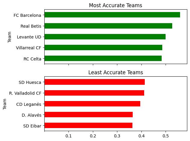
- example - we have statisctics on a per player basis for laliga, having columns for team name, shots taken, shots on target
- we would like to generate the plot below - x axis of the plot is shared
- generating the relevant data -
- first, we find total shots and shots on target by a team
- for this, we group by team, and perform sum aggregations for shots and shots on target
- we calculate accuracy using these two
- finally, we sort the data based on accuracy
team_stats = laliga.groupby('Team').agg(
    total=('Shots', 'sum'),
    on_target=('Shots on target', 'sum')
)
team_stats['accuracy'] = team_stats['on_target'] / team_stats['total']
team_stats.sort_values(['accuracy'], inplace=True)
team_stats

#                   total  on_target  accuracy
# Team
# SD Eibar          422    153        0.362559
# D. Alavés         299    109        0.364548
# CD Leganés        334    132        0.395210
# R. Valladolid CF  319    131        0.410658
# SD Huesca         343    142        0.413994
- generating the plot -
- most accurate teams - top 5 rows, least accurate teams - bottom 5. use head and tail to obtain them
- we have entirely different pandas plots that we would like to plot on the same figure on different axes. so, we use subplots. subplots can apart from dimensions, receive the sharex parameter
- note how we pass the axes received from subplots to plot
- we can set the xticks on (any) axes i guess
fig, axes = plt.subplots(2, 1, sharex=True)

team_stats.tail(5).plot(kind='barh', y='accuracy', ax=axes[0], legend=False, title='Most Accurate Teams', color='green')
team_stats.head(5).plot(kind='barh', y='accuracy', ax=axes[1], legend=False, title='Least Accurate Teams', color='red')

axes[0].set_xticks([0.1, 0.2, 0.3, 0.4, 0.5])

plt.tight_layout()
- we discuss hierarchical indexing next, but we can group by levels of hierarchical indices as well. we need to specify the levels keyword argument for that
state_pops

#              population
# state  year
# AK     1990  553290.0
#        1991  570193.0
#        1992  588736.0
# ...    ...   ...
# WY     2009  559851.0
#        2010  564222.0
#        2011  567329.0

state_pops.groupby(level=['year']).sum()

# year
# 1990  499245628.0
# 1991  505961884.0
# ...
# 2012  631398915.0
# 2013  635872764.0
- note - we specify name in this case, but we could have specified the level - 0, 1 etc as well
- if we see, the components of the hierarchical index are named, so specifying their names directly without the level keyword argument inside of groupby would have worked as well
state_pops.groupby('year').sum()

# year
# 1990  499245628.0
# 1991  505961884.0
# ...
# 2012  631398915.0
# 2013  635872764.0
- summary -
- we saw grouping using attributes by now
- but then we might want to group by index / components of hierachical index as well
- hence we could use the level keyword argument
- but then, we could use the same syntax as attributes for indices as well i.e. omit the level keyword argument
- also called multi indexing
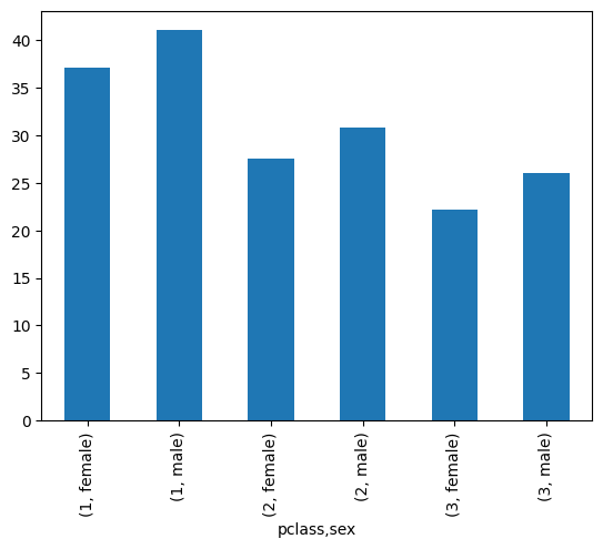
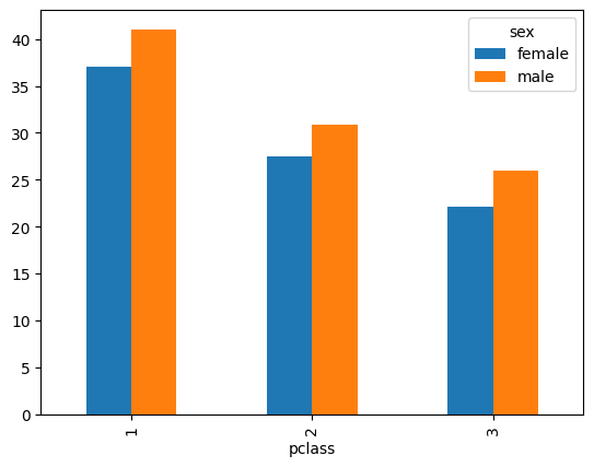
- when we group by a single column, we get the following result -
mean_by_sex = titanic.groupby('sex')['age'].mean()

mean_by_sex.index

# Index(['female', 'male'], dtype='object', name='sex')

mean_by_sex

# sex
# female    28.687071
# male      30.585233
- however, when we group by multiple columns, we get the following result -
mean_by_pclass_and_sex = titanic.groupby(['pclass', 'sex'])['age'].mean()

mean_by_pclass_and_sex.index

# MultiIndex([(1, 'female'),
#             (1,   'male'),
#             (2, 'female'),
#             (2,   'male'),
#             (3, 'female'),
#             (3,   'male')],
#            names=['pclass', 'sex'])

mean_by_pclass_and_sex

# pclass  sex
# 1       female    37.037594
#         male      41.029250
# 2       female    27.499191
#         male      30.815401
# 3       female    22.185307
#         male      25.962273
- so, labels instead of being a plain index are now multi index
- above, we showed a multi index with a series, below is an example of a multi index with a dataframe. the index in this case is the same as the one we got when doing a mean of age, only the entire data structure changes from a series to a dataframe
titanic.groupby(['pclass', 'sex']).mean(numeric_only=True)

#                 survived  age        sibsp     parch     fare
# pclass  sex
# 1       female  0.965278  37.037594  0.555556  0.472222  37.037594
#         male    0.340782  41.029250  0.340782  0.279330  41.029250
# 2       female  0.886792  27.499191  0.500000  0.650943  27.499191
#         male    0.146199  30.815401  0.327485  0.192982  30.815401
# 3       female  0.490741  22.185307  0.791667  0.731481  22.185307
#         male    0.152130  25.962273  0.470588  0.255578  25.962273
- typically when seting up an index, we want it to -
- be unique - having the same index for multiple rows in a dataframe does not give an error. but, it is typically not advisable - e.g. loc would give us multiple rows
- make our data easily accessible - use for e.g. semantic index / natural key
- imagine we have the following dataframe -
state_pops = pd.read_csv('data/state_pops.csv')
state_pops

#       state  year  population
# 0     AL     2012  4817528.0
# 1     AL     2010  4785570.0
# ...   ...    ...   ...
# 1270  USA    2011  311582564.0
# 1271  USA    2012  313873685.0
- we can set up a custom hierarchical index for this dataset
state_pops.set_index(['state', 'year'], inplace=True)
state_pops

#              population
# state  year
# AL     2012  4817528.0
#        2010  4785570.0
#        2011  4801627.0
# USA    2013  316128839.0
#        2009  306771529.0
#        2010  309326295.0
- if we try sorting the index, by default, the data is sorted in the order of levels - e.g. the data is sorted first by state, and for a state, the rows are sorted by years
state_pops.sort_index()

#              population
# state  year
# AK     1990  553290.0
#        1991  570193.0
#        1992  588736.0
# WY     2009  559851.0
#        2010  564222.0
#        2011  567329.0
- assume we want to sort the data by years only. so, all the data for the lowest year should come first and so on. we can do the below -
state_pops.sort_index(level=1)

#             population
# state year
# AK    1990  553290.0
# AL    1990  4050055.0
# ...   ...   ...
# WV    2013  1854304.0
# WY    2013  582658.0
- finally, assume we would like to sort in ascending order of state but then descending order of year. we can do the below -
state_pops.sort_index(level=[0, 1], ascending=[True, False])

#              population
# state  year
# AK     2013  735132.0
#        2012  730307.0
# ...    ...   ...
# WY     1994  480283.0
#        1993  473081.0
- finally - we were using numbers for levels till now, but names are supported as well - e.g. we can use
state_pops.sort_index(level=['year'], inplace=True) - indexing - behavior around slicing etc is pretty similar to what we studied here, just that we need to be wary of levels
- accessing by the first level only - we get back a dataframe, and not a series
state_pops.loc['WY']

#       population
# year
# 1990  453690.0
# 1991  459260.0
# 1992  466251.0
- accessing by all levels - we get back a series, where the indices are the columns. we need to provide a tuple with the values for all the levels.
state_pops.loc[('WY', 2013)]

# population    582658.0
- note - we can still use slicing etc when using tuples -
state_pops.loc[('WY', 2010) : ('WY', 2013)]

#              population
# state  year
# WY     2010  564222.0
#        2011  567329.0
#        2012  576626.0
#        2013  582658.0
- till now, we saw accessing using the 1st level and all levels. what if we would like to access using some intermediate level(s)?
- first, recall from updating, if we have a normal dataframe without the hierarchical indexing, we would use loc as follows (remember that
: by itself means everything - all indices / all columns depending on where it is used) -titanic
# pclass survived
# 0 1 1
# 1 1 1
# 2 1 0
titanic.loc[:, 'pclass']
# 0 1
# 1 1
# 2 1
titanic.loc[:, ['pclass']]
# pclass
# 0 1
# 1 1
# 2 1
titanic.loc[:, :]
# pclass survived
# 0 1 1
# 1 1 1
# 2 1 0
- so, extending on the above for a dataframe with hierarchical indexing, my understanding is we will need extra commas for the extra levels. so, back to our original question of how to access using selective levels when we have hierarchical indexing - we can for e.g. just use
: for the levels for which we want everything, and specify singular values using a, specify ranges like a:b, specify selected values using [a,b] etc based on use casestate_pops.loc[:,:,]
# population
# state year
# AK 1990 553290.0
# 1991 570193.0
# ... ... ...
# WY 2009 559851.0
# 2010 564222.0
# since we specify only one year
# pandas would eliminate this column altogether
state_pops.loc[:,2010,:]
# population
# state
# AK 713868.0
# AL 4785570.0
# AR 2922280.0
# AZ 6408790.0
# CA 37333601.0
# CO 5048196.0
state_pops.loc[:,[2010,2013],:]
# population
# state year
# AK 2010 713868.0
# 2013 735132.0
# AL 2010 4785570.0
# 2013 4833722.0
# ... ... ...
# WV 2010 1854146.0
# 2013 1854304.0
# WY 2010 564222.0
# 2013 582658.0
state_pops.loc[:,2010:2012,:]
# population
# state year
# AK 2010 713868.0
# 2011 723375.0
# 2012 730307.0
# AL 2010 4785570.0
# 2011 4801627.0
# ... ... ...
# WV 2011 1855184.0
# 2012 1856680.0
# WY 2010 564222.0
# 2011 567329.0
# 2012 576626.0
- cross section or
xs is another useful alternative to the loc syntax when using hierarhcical indexing. i will stick to loc for now though
- for accessing all values of a column, we use the syntax
df['col_name'], but this would not work for index column(s) - to access the values of an index when a dataframe does not have hierarchical indexing, we use
df.index - what if we wanted to access the components of a hierarchical index? assume our dataframe looks like this -
#              population
# state  year
# AK     1990  553290.0
#        1991  570193.0
#        1992  588736.0
# ...    ...   ...
# WY     2009  559851.0
#        2010  564222.0
#        2011  567329.0
- to access the index values of a particular position, we can use the following -
state_pops.index[0]  # ('AK', 1990)
state_pops.index[1]  # ('AK', 1991)
state_pops.index[2]  # ('AK', 1992)
- to access all the index values, we have two options according too my understanding -
- option 1 - access via the levels property. but, it will only have the unique values - it would not be an accurate representation of our data
state_pops.index.levels
# FrozenList([['AK', 'AL', 'AR', 'AZ', 'CA', 'CO', 'CT', 'DC', 'DE', 'FL', 'GA', 'HI', 'VT', 'WA', 'WI', 'WV', 'WY'],
#             [1990, 1991, 1992, 1993, 1994, 1995, 1996, 1997, 1998, 1999, 2000, 2001, 2002, 2003, 2004, 2005, 2006, 2007, 2008, 2009, 2010, 2011, 2012, 2013]]

state_pops.index.levels[0]
# Index(['AK', 'AL', 'AR', 'AZ', 'CA', 'CO', 'CT', 'DC', 'DE', 'FL', 'GA', 'HI',
#       'VT', 'WA', 'WI', 'WV', 'WY']

state_pops.index.levels[1]
# Index([1990, 1991, 1992, 1993, 1994, 1995, 1996, 1997, 1998, 1999, 2000, 2001,
#        2002, 2003, 2004, 2005, 2006, 2007, 2008, 2009, 2010, 2011, 2012, 2013],
- option 2 - accessing via get level values. usecase - recall how we performed filtering using column attributes -
df[df['col'] > 500]. we can do the same when using option 2. our conditions will look like this now - df[df.index.get_level_values(1) > 500]state_pops.index.get_level_values(0)
# Index(['AK', 'AK', 'AK', 'AK', 'AK', 'AK', 'AK', 'AK', 'AK', 'AK',
# ...
# 'WY', 'WY', 'WY', 'WY', 'WY', 'WY', 'WY', 'WY', 'WY', 'WY'],
state_pops.index.get_level_values(1)[:50]
# Index([1990, 1991, 1992, 1993, 1994, 1995, 1996, 1997, 1998, 1999, 2000, 2001,
# 2002, 2003, 2004, 2005, 2006, 2007, 2008, 2009, 2010, 2011, 2012, 2013,
# 1990, 1991, 1992, 1993, 1994, 1995, 1996, 1997, 1998, 1999, 2000, 2001,
# 2002, 2003, 2004, 2005, 2006, 2007, 2008, 2009, 2010, 2011, 2012, 2013,
# 1990, 1991],
- concat - concatenate series / dataframes
import pandas as pd

s1 = pd.Series(['a', 'b', 'c'])
s2 = pd.Series(['d', 'e', 'f'])

pd.concat([s1, s2])
# 0    a
# 1    b
# 2    c
# 0    d
# 1    e
# 2    f
- we can set ignore index to true if our index was not semantic. notice the difference in the index values above and below
pd.concat([s1, s2], ignore_index=True)
# 0    a
# 1    b
# 2    c
# 3    d
# 4    e
# 5    f
- we can concatenate by index follows -
pd.concat([s1, s2], axis='columns')
#   0 1
# 0 a d
# 1 b e
# 2 c f
- however, this is not just putting side by side - it is actually using the index values to join. e.g. -
food = pd.Series(
    data=['avocado', 'blueberry', 'cucumber'],
    index=['a', 'b', 'c']
)

animals = pd.Series(
    data=['dolphin', 'bear', 'chameleon'],
    index=['d', 'b', 'c']
)

pd.concat([food, animals], axis='columns')

#    0          1
# a  avocado    NaN
# b  blueberry  bear
# c  cucumber   chameleon
# d  NaN        dolphin
- notice the column names would be numeric by default. we can change that using the keys keyword argument
pd.concat([food, animals], axis='columns', keys=['khana', 'janwar'])

#    khana      janwar
# a  avocado    NaN
# b  blueberry  bear
# c  cucumber   chameleon
# d  NaN        dolphin
- note - we saw NaN earlier, because the join is outer by default. we can set it to inner as well
pd.concat([food, animals], axis='columns', join='inner')

#    0          1
# b  blueberry  bear
# c  cucumber   chameleon
- till now, we were combining series. now, we combine dataframes. assume we have the data below -
harvest_21 = pd.DataFrame(
    [['potatoes', 9001], ['garlic', 1350], ['onions', 87511]],
    columns=['crop', 'qty']
)
#    crop      qty
# 0  potatoes  9001
# 1  garlic    1350
# 2  onions    87511

harvest_22 = pd.DataFrame(
    [[1600, 'garlic'], [560, 'spinach'], [999, 'turnips'], [1000, 'onions']],
    columns=['qty', 'crop']
)
#    qty   crop
# 0  1600  garlic
# 1  560   spinach
# 2  999   turnips
# 3  1000  onions
- when we try to concatenate the two dataframes, we get the below. note - even though the ordering of columns for the two dataframes were different, pandas combines them using the column names
pd.concat([harvest_21, harvest_22])
#    crop      qty
# 0  potatoes  9001
# 1  garlic    1350
# 2  onions    87511
# 0  garlic    1600
# 1  spinach   560
# 2  turnips   999
# 3  onions    1000
- assume we have another dataframe with an extra column -
harvest_23 = pd.DataFrame(
    [['potatoes', 900, 500], ['garlic', 1350, 1200], ['onions', 875, 950]],
    columns=['crop', 'qty', 'profit']
)
#    crop      qty   profit
# 0  potatoes  900   500
# 1  garlic    1350  1200
# 2  onions    875   950
- if we now try concatenating two dataframes with difference in columns, we get NaN for the missing columns
pd.concat([harvest_22, harvest_23])
#    qty   crop      profit
# 0  1600  garlic    NaN
# 1  560   spinach   NaN
# 2  999   turnips   NaN
# 3  1000  onions    NaN
# 0  900   potatoes  500.0
# 1  1350  garlic    1200.0
# 2  875   onions    950.0
- to change this behavior, we can specify inner for the join type
pd.concat([harvest_22, harvest_23], join='inner')
#    qty   crop
# 0  1600  garlic
# 1  560   spinach
# 2  999   turnips
# 3  1000  onions
# 0  900   potatoes
# 1  1350  garlic
# 2  875   onions
- the ignore index parameter behaves in the same way, already discussed
- we can also set up hierarchical indexing using the keys parameter - e.g. it is typical to analyze files for different years simultaneously, and we might want to encode this information in the form of a hierarchical index for the dataframe
pd.concat([harvest_21, harvest_22, harvest_23], join='inner', keys=[2021, 2022, 2023])
#          crop      qty
# 2021  0  potatoes  9001
#       1  garlic    1350
#       2  onions    87511
# 2022  0  garlic    1600
#       1  spinach   560
#       2  turnips   999
#       3  onions    1000
# 2023  0  potatoes  900
#       1  garlic    1350
#       2  onions    875
- its closer to a database style join and is more flexible than concat since we can combine using columns instead of relying on the index
teams = pd.DataFrame(
    [
        ["Suns", "Phoenix", 20, 4],
        ["Mavericks", "Dallas", 11, 12],
        ["Rockets", "Houston", 7, 16],
        ["Nuggets", "Denver", 11, 12]
    ],
    columns=["team", "city", "wins", "losses"]
)
#    team       city     wins  losses
# 0  Suns       Phoenix  20    4
# 1  Mavericks  Dallas   11    12
# 2  Rockets    Houston  7     16
# 3  Nuggets    Denver   11    12

cities = pd.DataFrame(
    [
        ["Houston", "Texas", 2310000],
        ["Phoenix", "Arizona", 1630000],
        ["San Diego", "California", 1410000],
        ["Dallas", "Texas", 1310000]
    ],
    columns=["city", "state", "population"]
)
#    city       state       population
# 0  Houston    Texas       2310000
# 1  Phoenix    Arizona     1630000
# 2  San Diego  California  1410000
# 3  Dallas     Texas       1310000
- now, if we perform a merge, an inner join is performed using the common column name automatically -
teams.merge(cities)
#    team       city     wins  losses  state    population
# 0  Suns       Phoenix  20    4       Arizona  1630000
# 1  Mavericks  Dallas   11    12      Texas    1310000
# 2  Rockets    Houston  7     16      Texas    2310000
- we can set the how parameter for join type. as we saw, it is inner by default, but we can set it to outer, left, right, etc
teams.merge(cities, how='left')

#    team       city     wins  losses  state    population
# 0  Suns       Phoenix  20    4       Arizona  1630000.0
# 1  Mavericks  Dallas   11    12      Texas    1310000.0
# 2  Rockets    Houston  7     16      Texas    2310000.0
# 3  Nuggets    Denver   11    12      NaN      NaN
- cross join is also there - all rows of one dataframe with all rows of the other dataframe
- by default, the same column name was used explicitly. we can however, specify the column(s) explicitly using the on keyword argument
teams.merge(cities, on='city')
- note - we can specify multiple columns for the on parameter as well based on use case
- what if the two dataframes have similar column names, and are not being used for joining? pandas will suffix them with _x and _y by default. e.g. below, the name column is being used for the join, so it is only present once. however, the score column is not, and therefore it is preset with a suffix
midterm = pd.DataFrame(
    [['shameek', 42], ['colt', 45]],
    columns=['name', 'score']
)

final = pd.DataFrame(
    [['shameek', 85], ['colt', 97]],
    columns=['name', 'score']
)

midterm.merge(final, on='name')

#     name    score_x  score_y
# 0  shameek  42       85
# 1  colt     45       97
- we can however, specify the suffixes to append -
midterm.merge(final, on='name', suffixes=['_midterm', '_final'])

#    name     score_midterm  score_final
# 0  shameek  42             85
# 1  colt     45             97
- also note how we had to specify on explicitly, otherwise both name and score would be used. since there is no data with the same value in both tables, we end up with an empty result set
- uses matplotlib underneath, and works well with pandas
- typically imported as sns
import seaborn as sns
- to play around with seaborn, we can use any of the datasets present here via load dataset. it returns the pandas dataframe
tips = sns.load_dataset('tips')
tips

#    total_bill  tip   sex     smoker  day  time    size
# 0  16.99       1.01  Female  No      Sun  Dinner  2
# 1  10.34       1.66  Male    No      Sun  Dinner  3
# 2  21.01       3.50  Male    No      Sun  Dinner  3
- note - for the default theme of sns to kick in which kind of looks good, run the following
sns.set_theme()
- for a scatterplot, we can do the following -
sns.scatterplot(tips, x='total_bill', y='tip')
- note - the exact above result could have been achieved without seaborn as well -
tips.plot(kind='scatter', x='total_bill', y='tip')
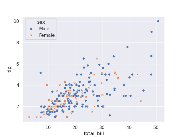
- but, now, look how we can simply pass hue for different scatter plots based on color on the same axes -
sns.scatterplot(tips, x='total_bill', y='tip', hue='sex')
- further, we can pass in style for different scatter plots based on marker on the same axes
sns.scatterplot(tips, x='total_bill', y='tip', hue='sex', style='smoker')
- note - if we use the same column for hue and style, the marker and color both change, thus maybe improving readability
sns.scatterplot(tips, x='total_bill', y='tip', hue='sex', style='sex')
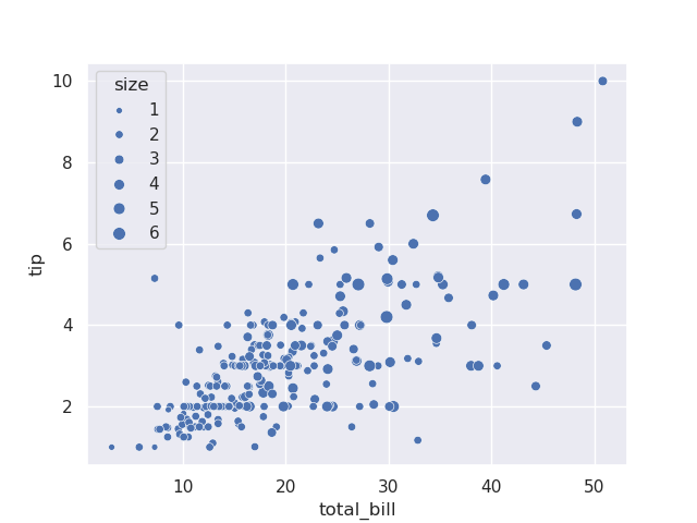
- e.g. assume tips have a size column, which represents the number of people together. we can add the size keyword argument, which changes the size of the marker
sns.scatterplot(tips, x='total_bill', y='tip', size='size')
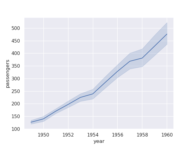
- assume we have a dataset for flights like so i.e. we have 12 records per year for each of the months -
flights = sns.load_dataset('flights')
flights

#    year  month  passengers
# 0  1949  Jan    112
# 1  1949  Feb    118
# 2  1949  Mar    132
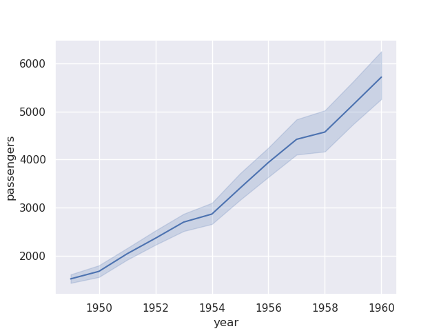
- e.g. we try to create a lineplot below. but, we do not specify how it should plot the multiple records that it gets for a passenger in a year. it plots using the estimator as mean by default
sns.lineplot(flights, x='year', y='passengers')
- if we wanted to achieve this ourselves using matplotlib, we would have to group it and then use the aggregation function like below -
flights.groupby('year')['passengers'].mean().plot()
- estimators are pandas functions. we can also provide a custom estimator, e.g.
sum as so -sns.lineplot(flights, x='year', y='passengers', estimator='sum')
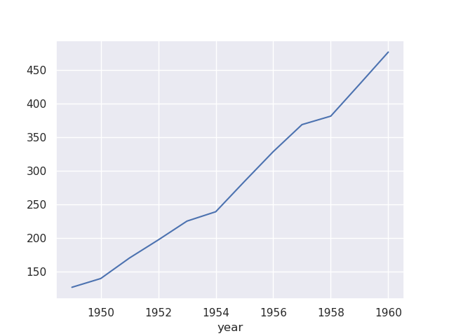
- note how there is also a confidence interval that seaborn also adds to the plot. we can control its width, method, etc using error bar. setting it to None would remove it completely
sns.lineplot(flights, x='year', y='passengers', estimator='sum', errorbar=None)
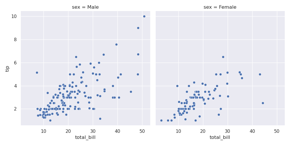
- my understanding - seaborn has two kinds of plots - figure level plots and axes level plots. the ones we saw above - lineplot and scatterplot are axes level plots their corresponding figure level plot is relplot or relational plot
# initial
sns.scatterplot(data=tips, x='total_bill', y='tip')

# using relplot
sns.relplot(data=tips, x='total_bill', y='tip', kind='scatter')
- but now, we can easily put different subplots / different axes on the same figure
- e.g. assume we would like to have different columns for the different values of sex
sns.relplot(data=tips, x='total_bill', y='tip', row='time', col='sex', hue='smoker')
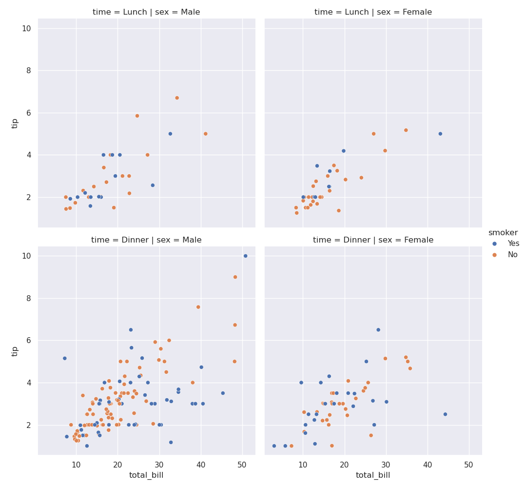
- a more involved example. break into -
- columns using sex
- rows using time - lunch or dinner
- different colors for smokers and non smokers
sns.relplot(data=tips, x='total_bill', y='tip', row='time', col='sex', hue='smoker')
- controlling figure size for axes level plots - we make the figure call first
plt.figure(figsize=(4, 3))
sns.scatterplot(data=tips, x='total_bill', y='tip')
- controlling figure size for figure level plots - relplot creates a figure for us bts, so we cannot call the figure ourselves. instead, we control size of each facet i.e. subplot using height and aspect (ratio between height and width)
sns.relplot(data=tips, x='total_bill', y='tip', row='time', col='sex', hue='smoker', height=3, aspect=2)
- relation plots - relation between two things x and y
- distribution plots - distribution of data, e.g. histogram
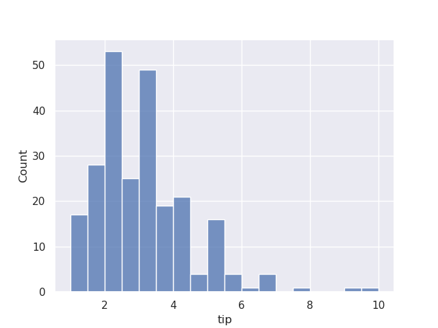
- histogram example - assume we try to visualize the tips dataset -
sns.histplot(data=tips, x='tip')
- if we use hue, by default, they would come one on top of another. the opacity is such that they are see through -
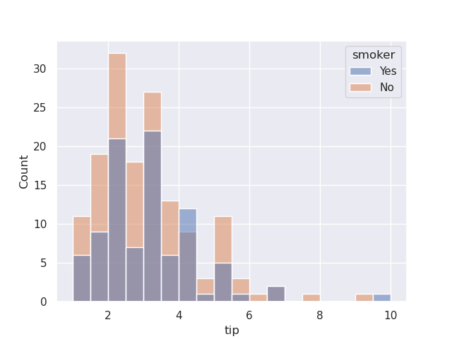
sns.histplot(data=tips, x='tip', hue='smoker')
- we can configure it to be stacked instead of appearing one on top of another
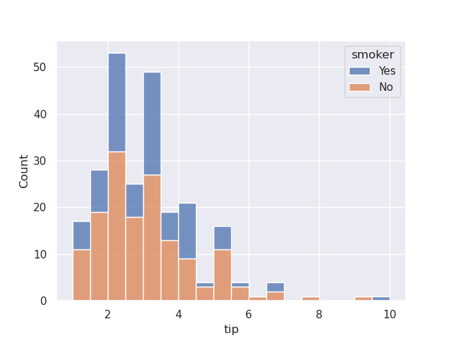
sns.histplot(data=tips, x='tip', hue='smoker', multiple='stack')
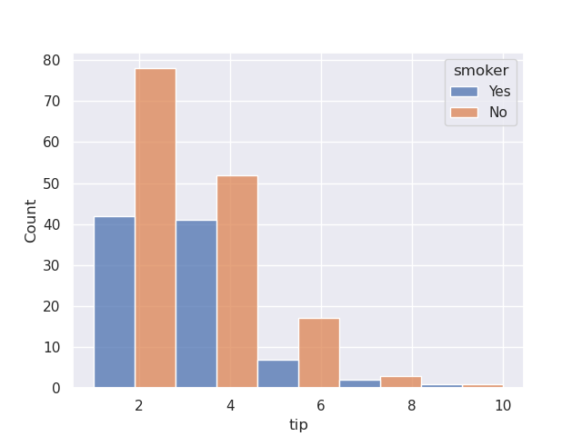
- we can also set multiple to be dodge, so that appear one beside another. note how i also configure bins in this case
sns.histplot(data=tips, x='tip', hue='smoker', multiple='dodge', bins=5)
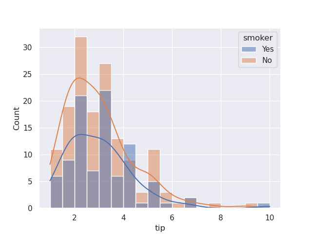
- finally, we can add the kde curve to the histogram plot as well by setting kde to true
sns.histplot(data=tips, x='tip', hue='smoker', kde=True)
- above, we ovrlayed the kde curve on top of the histogram. however, we can add a standalone kde curve as well. below, we try to visualize the weights of different species of penguins simultaneously
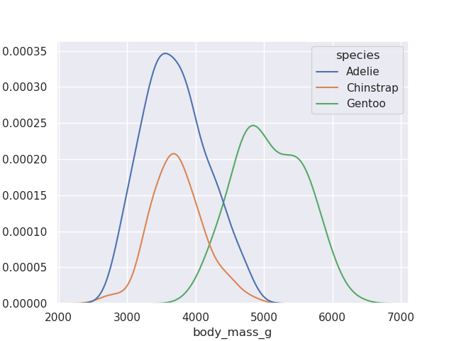
sns.kdeplot(data=penguins, x='body_mass_g', hue='species')
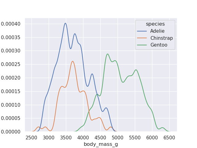
- finally, we can also configure the precision by adjusting the bandwidth
sns.kdeplot(data=penguins, x='body_mass_g', hue='species', bw_adjust=0.4)
- histograms / kde plots are also called as univariate distribution plots i.e. we only look at the distribution of a single feature
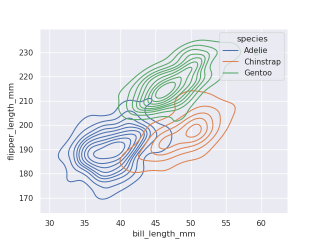
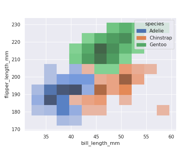
- we can look at bivariate distribution plots as well i.e. analyze two features at once, both on x and y axis
- kde bivariate distribution plots - try looking for smoother curves (like the hollow i believe?)
sns.kdeplot(data=penguins, x='bill_length_mm', y='flipper_length_mm', hue='species')
- histogram bivariate distribution plots - try looking for the concentrated coloring (like a heat map)
sns.histplot(data=penguins, x='bill_length_mm', y='flipper_length_mm', hue='species')
- rugplots - ticks along the x or y axis to show the presence of an observation
sns.rugplot(data=penguins, x='body_mass_g')
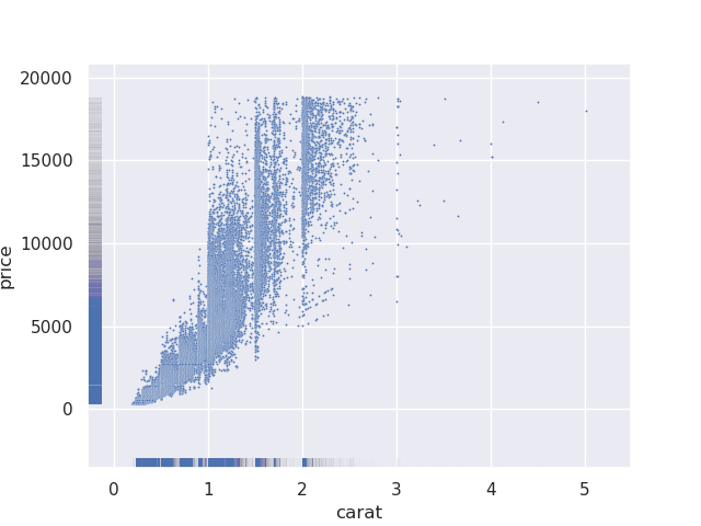
- this is not very useful by itself. because rugplots are useful when used with other plots. e.g. below, from our scatterplot, it is difficult to find out where the majority of the values lie, so we supplement it with a rugplot
sns.scatterplot(data=diamonds, x='carat', y='price', s=2)
sns.rugplot(data=diamonds, x='carat', y='price', alpha=0.005)
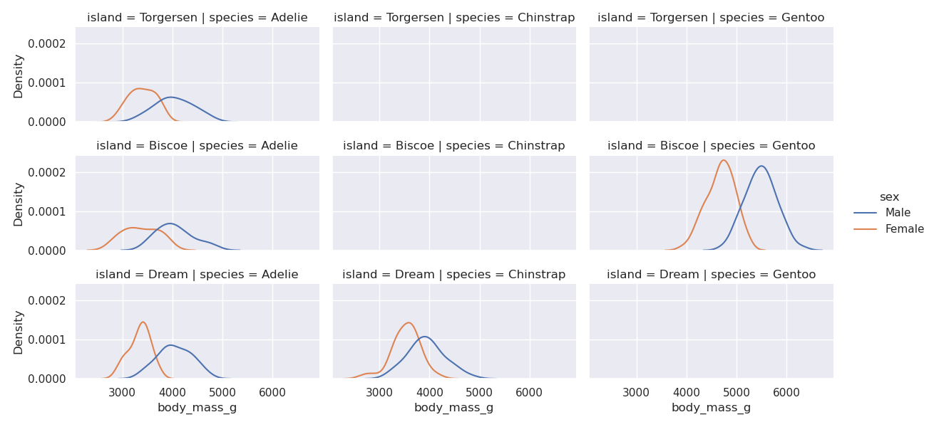
- we use displot for the figure level plot of distibution plots, no surprises here
sns.displot(data=penguins, kind='kde', x='body_mass_g', col='species', row='island', height=2, aspect=2, hue='sex')
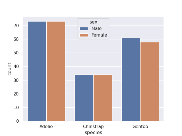
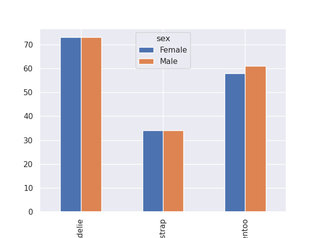
- count plot - displays count. but unlike histograms which typically used for numerical data, count plots are typically used for non numerical data
sns.countplot(data=penguins, x='species', hue='sex')
- to achieve something similar when using matplotlib by itself, i did the following -
penguins[['species', 'sex']].value_counts().unstack('sex').plot(kind='bar')
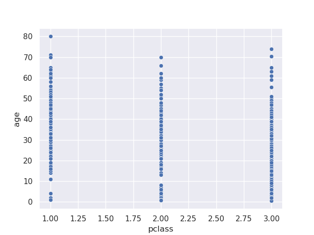
- issue - if we tried to make a scatterplot for categorical data - it would be hard to comment on the density -
sns.scatterplot(data=titanic, x='pclass', y='age')
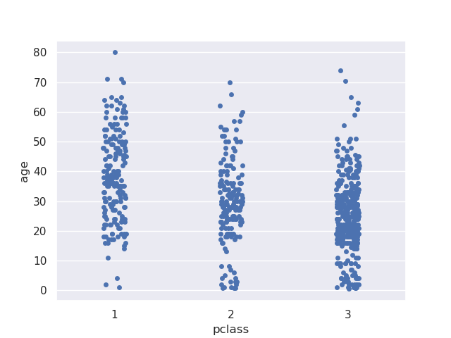
- solution 1 - we can use stripplot - it introduces a little bit of jitter to improve readability -
sns.stripplot(data=titanic, x='pclass', y='age')
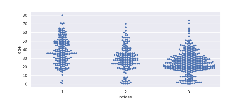
- solution 2 - we can use swarmplot - it ensures points are non overlapping to improve readability. my understanding - use this only for smaller / sampled datasets, otherwise achieving this can become difficult
plt.figure(figsize=(10, 4))
sns.swarmplot(data=titanic, x='pclass', y='age')
- note how i had to adjust the figuresize, otherwise i get the warning -
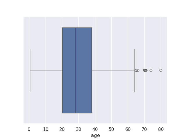
UserWarning: 15.2% of the points cannot be placed; you may want to decrease the size of the markers or use stripplot. - box plots - helps visualize distribution of categorical data easily. features -
- q1 represents the 25% value
- q3 represents the 75% value
- we have the median value plotted in between
- the range between q1 to q3 is called iqr or inter quartile range
- the lines surrounding iqr are called whiskers. they are placed relative to q1 and q3, and default to 1.5 i believe
- finally, we have outliers outside these whiskers
sns.boxplot(data=titanic, x='age')
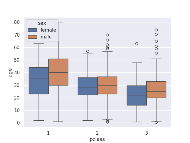
- using boxplot for categorical data -
sns.boxplot(data=titanic, x='pclass', y='age', hue='sex')
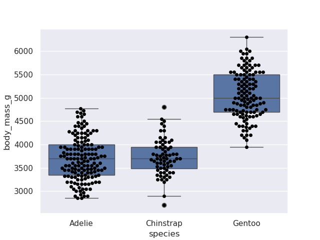
- combining boxplot and swarmplot. small reminder from matplotlib that they go into the same figure and axes since we do not call a
plt.figure() in betweensns.boxplot(data=penguins, y='body_mass_g', x='species')
sns.swarmplot(data=penguins, y='body_mass_g', x='species', color='black')
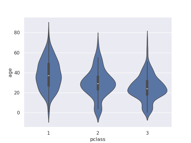
- violin plot - has the box plot at the center along with the kde curve. carefully look at the black line to see the median, inter quartile range and whiskers
sns.violinplot(data=titanic, x='pclass', y='age')
- note - if we add a hue, it creates different violin plots side by side
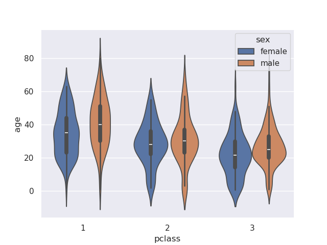
sns.violinplot(data=titanic, x='pclass', y='age', hue='sex')
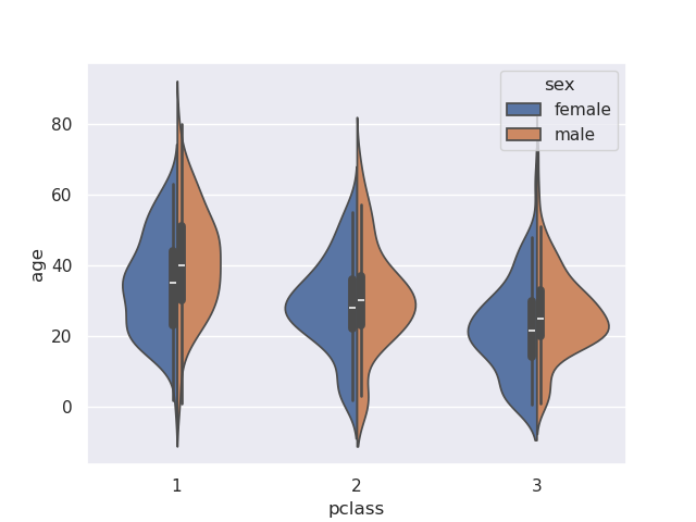
- we can however, change this behavior by providing the split parameter
sns.violinplot(data=titanic, x='pclass', y='age', hue='sex', split=True)
- bar plot - again, compare the difference from matplotib, where there is no calculation - it just plots, while seaborn grouping and using an estimator like we saw in line plots
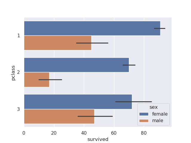
sns.barplot(data=titanic, y='pclass', x='survived', hue='sex', estimator='sum', orient='h')
- the black line i believe helps with approximation and thus faster plotting and calculations
- plotting the same thing using matplotlib -
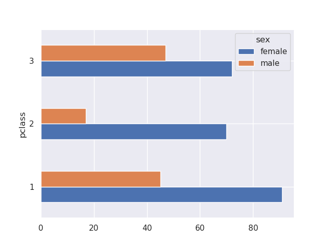
titanic.groupby(['pclass', 'sex'])['survived'].sum().unstack().plot(kind='barh')
- categorical plot - figure level plot, not bothering as there is nothing new